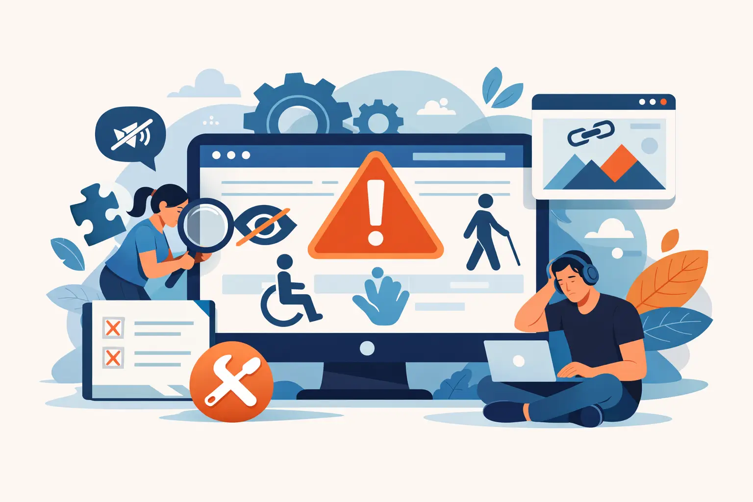
10 WordPress Accessibility Mistakes to Fix
A WordPress site can look polished, load quickly, and still exclude people who use a keyboard, screen reader, magnification, or voice control. The most common WordPress accessibility mistakes are rarely dramatic coding failures. They are routine publishing and configuration decisions that accumulate across pages, templates, forms, menus, and documents.
For organizations subject to ADA-related accessibility expectations, Section 508 requirements, or internal WCAG policies, finding an issue after launch is not enough. Accessibility needs to be part of the WordPress publishing workflow, with repeatable checks and clear ownership for remediation.
1. Treating an accessibility widget as compliance
An accessibility widget may give visitors useful controls for text size, contrast, or focus visibility. It does not repair missing form labels, inaccessible custom menus, incorrect heading structures, or unlabeled buttons in the underlying code.
This mistake creates false confidence. WCAG conformance depends on the website’s actual content, markup, and interactive behavior. A visitor should be able to operate the site without needing to activate a separate interface first.
Use visitor-facing tools as a supplement, not as the compliance strategy. Audit and remediate the source issues across the WordPress environment.
2. Publishing images without meaningful alternative text
Alternative text is one of the most frequently missed requirements in WordPress because the Media Library makes it easy to upload an image and move on. But an empty or generic field such as “banner,” “image,” or a file name does not tell a screen reader user what the image contributes to the page.
Write alt text for the image’s purpose in context. A product image may need a concise description of the product. A chart may require nearby text that explains its data and conclusion. Decorative images should generally be marked as decorative so they are not announced unnecessarily.
The trade-off is that not every image needs a long description. Repeating text already beside the image adds noise. The objective is equivalent meaning, not a literal inventory of pixels.
3. Using headings for appearance instead of structure
Headings create a navigational outline for screen reader users and help all visitors scan complex content. A common WordPress problem occurs when authors select heading levels because they like the font size, then jump from an H1 to an H4 or use bold paragraphs as section titles.
Each page should normally have a clear H1 that identifies its primary topic. Subsequent headings should follow a logical hierarchy. An H2 introduces a major section; an H3 belongs within that section. The visual design can be adjusted in the theme or editor styles without breaking the document outline.
This matters especially on government, education, and service sites where pages often contain policy information, instructions, tables, forms, and downloadable materials. Clear structure makes that information usable under time pressure.
4. Relying on color alone to communicate status
Red error text, green confirmation messages, and color-coded charts are common patterns. They fail when color is the only way a visitor can distinguish meaning.
A required form field should not be identified only by a red border. Add visible text, an appropriate programmatic indicator, and a clear explanation of what is required. A chart should use labels, patterns, data values, or another distinction in addition to color. Error messages should identify the field and explain how to correct it.
Color contrast is a related but separate issue. Text and essential interface components need sufficient contrast against their backgrounds. Brand colors can often remain part of the design, but they may need adjustment for small text, hover states, disabled-looking controls, and links within body copy.
5. Creating keyboard traps in menus, popups, and sliders
A person who cannot use a mouse must be able to navigate every interactive feature using a keyboard. That includes primary navigation, search, modal windows, accordion panels, carousels, cookie notices, chat interfaces, and page-builder components.
The failure is not always that keyboard access is completely absent. More often, focus disappears, moves in an unexpected order, becomes hidden behind a sticky header, or gets trapped inside a popup with no reliable way out. A user must be able to see where focus is, open a component, use its controls, close it, and return to a sensible point on the page.
Test this directly. Starting at the browser address bar, use Tab, Shift+Tab, Enter, Space, and Escape to complete key tasks. Can you submit a contact form, access submenus, choose a date, close a dialog, and complete a purchase without touching a mouse? Automated testing can identify many issues, but this interaction test remains necessary.
6. Using links and buttons interchangeably
A link takes a user to another location, file, page, or section. A button performs an action, such as opening a menu, submitting a form, adding an item to a cart, or revealing content. When WordPress themes or page builders blur that distinction, assistive technology users receive inaccurate expectations.
Avoid vague link text such as “click here,” “read more,” or “learn more” when multiple instances appear on a page. The accessible name should make sense when read independently. “Read the 2026 accessibility policy” is more useful than “read more.”
Also review icon-only controls. A magnifying glass, social icon, or arrow may be visually obvious, but it still needs an accessible name that identifies its action. Tooltips alone are not a dependable substitute.
7. Leaving forms without labels and usable error handling
Forms are a high-risk area because they often support essential tasks: requesting services, applying for programs, paying invoices, registering for events, or contacting an agency. Placeholder text is not a replacement for a visible, programmatically associated label. It disappears as the user types and is not consistently exposed in the same way across technologies.
Every input needs a clear label. Required fields, formatting rules, and error messages must be understandable before and after submission. If an error occurs, the form should identify what went wrong and preserve information the user already entered whenever possible.
Third-party form plugins can help or hinder compliance depending on their settings, templates, and add-ons. Do not assume a popular plugin is accessible in every configuration. Test the actual form visitors use on desktop and mobile.
8. Ignoring PDFs and other uploaded documents
Accessibility responsibility does not end at the web page. A linked PDF, Word document, spreadsheet, or presentation can be part of the same public service, application process, or legal notice. A PDF created by scanning a paper document may be unreadable to a screen reader even when it appears perfectly clear on screen.
Before publishing, determine whether the document is necessary as a download. If the information is short or frequently updated, HTML content is often easier to maintain and more usable on mobile devices. When a PDF is required, it needs its own accessibility review, including tags, reading order, headings, table structure, image descriptions, and document title.
Do not overlook the link itself. Let users know when a link opens a PDF and, where practical, provide useful context such as the document name or file type.
9. Assuming a compliant theme stays compliant after customization
A theme may begin with good accessibility support, then lose it through custom CSS, template overrides, page-builder layouts, plugin updates, or embedded code. Removing focus outlines, inserting empty links for visual effects, and changing heading levels in templates are all common regressions.
This is why WordPress accessibility review must include more than posts and pages. Evaluate menus, widgets, custom post types, archive templates, search results, footer content, login flows, checkout paths, and theme files. Agencies should apply the same review standard to reusable modules before deploying them across client sites.
A WordPress-native scanner such as WP ADA Compliance Check can help teams identify issues across published content and broader site components, while providing code locations and remediation guidance. Automation is particularly useful for ongoing monitoring after content changes and plugin updates.
10. Treating accessibility as a one-time pre-launch task
A launch audit is valuable, but WordPress sites change constantly. Editors add images, marketing teams publish landing pages, developers update plugins, and administrators upload documents. Any one of those actions can introduce a new WCAG failure.
The practical answer is governance. Define who reviews accessibility findings, how urgent issues are prioritized, and what must be checked before content is published. Publishing controls, recurring scans, and documented remediation procedures reduce dependence on one developer or one annual audit.
Not every finding carries the same user impact or remediation effort. Address barriers to core tasks first, especially inaccessible forms, keyboard failures, missing labels, low-contrast text, and essential documents. Then use recurring auditing to prevent the same patterns from returning.
Accessibility becomes manageable when it is treated like security, quality assurance, and content governance: a continuing operational responsibility with measurable checks. A site that can be used by more people is better prepared for compliance review and better able to serve the public when it matters most.
Subscribe
Subscribe to receive daily Web Accessibility - Did you know? articles in your inbox.